Color palette
Six colours, no seventh. Midnight Navy is the ground for every dark panel and the colour of headings on white. Royal Blue is the accent on white. Graphite carries body text.
-
#0C2340
Midnight Navy
The ground. Dark panels, the footer, and headings set on white.
-
#0057D8
Royal Blue
The accent, on white only. Links, key words, primary fills.
-
#6CCBFF
Ice Blue
The accent on navy, where Royal Blue is too dark to read.
-
#FFFFFF
White
The page, and text on every dark ground.
-
#B8C2CC
Silver
Hairlines, borders and dividers. Never text on white.
-
#2C2F36
Graphite
Body text on white, and the second dark ground.
| Pair | Ratio | Verdict |
|---|---|---|
| White on Midnight Navy | 15.8 | Passes at every size. |
| Graphite on White | 13.4 | Passes at every size. This is body text. |
| Ice Blue on Midnight Navy | 8.7 | Passes at every size. Labels on dark panels. |
| Royal Blue on White | 6.3 | Passes at every size. Links and key words. |
| Royal Blue on Midnight Navy | 2.5 | Fails. Use Ice Blue on navy instead. |
| Silver on White | 1.8 | Fails. Silver draws lines, it does not carry words. |
Ratios are WCAG 2.1 contrast, computed from the hex values above. The bar for body text is 4.5, and for text at 24px, or 18.7px bold, it is 3.0.
Logo
One mark, and it is the file in assets/icons/logo.png. The wordmark drawn inside Brand Kit 3.0 is an earlier design and is not in use.

Secondary badge and shield icon A circular badge and a shield were drawn in the kit, but no file exists for either. Placeholder. Waiting on artwork.
On Midnight Navy. The mark carries its own dark base, so it needs no plate.
On white. The line MOBILE DETAILING inside the mark is 3.7 percent of its width, so below about 220px wide it stops being readable.
Nothing to show yet.
The mark is a raster PNG at 1000 by 1000 with a transparent ground. There is no vector and none is being traced from the picture: an auto-trace of the foam, the gradients and the tools produces mush. Building clean vectors of the shield, the wordmark and the service icons is its own piece of work.
Typography
Two faces. Montserrat Extra Bold sets every headline, uppercase. Inter Regular sets everything a person reads in sentences.
Headlines
Montserrat
Extra Bold
Weight 800 only. Uppercase, tracking held near zero. Tighten to -0.005em above 48px, where the default spacing opens up.
Body text
Inter Regular
The quick brown fox jumps over the lazy dog.
Weight 400 for prose, 600 and 700 for labels and emphasis. Line height 1.65 at body size.
Protect your vehicle
64px / 1.02 / -0.005em
uppercase
Exterior detail
28px / 1.15 / 0.015em
uppercase
Ceramic coating
20px / 1.25 / 0
Professional auto detailing at your home or office.
20px / 1.5 / 0
Exterior, interior, ceramic coatings and maintenance plans. We come to you, we use professional products, and the work is guaranteed.
16px / 1.65 / 0
Small sits under a caption or a price, where it still has to be readable at a glance.
14px / 1.55 / 0
Book online
12px / 1.2 / 0.13em
uppercase
Every line of specimen text above is lifted from Brand Kit 3.0, so nothing on this page states something Moe has not already said. Both faces are on Google Fonts, so nothing needs licensing or hosting. The fallback stack is Helvetica Neue then Arial, which keeps the widths close if the webfont is slow.
Spacing & radius
Both scales are measured off Brand Kit 3.0 at its own width of 853 pixels, scaled to this page's 1120 pixel column, and rounded to the nearest 4. The bars below are drawn at their real size.
Spacing
-
4A hex above its swatch name. In the kit, 3px.
-
8Between tiles in a grid. In the kit, 6px between the colour swatches.
-
16A label to the thing it labels. In the kit, 13px.
-
32Across a hairline, from one section's content to the next. In the kit, 25px.
-
64The gutter either side of a vertical rule. In the kit, 46px.
Radius
-
0Rules, bars, the footer, and anything that runs to the edge.
-
4pxSwatches, photographs in a grid, the brand element tiles. The kit breaks these corners by about 2px at its own width.
-
8pxPanels that sit on the page as objects. The kit's card is about 6px.
-
FullThe secondary badge, which is a circle, and nothing else.
Four radii, assigned by role. If everything on a page carries the same corner, nothing on it looks more important than anything else.
Brand elements
Three treatments, all built in CSS, all drawn from what light does to wet paint. The kit calls them subtle. That is the instruction: one per screen, sitting behind content, never scattered.
Gloss line
Water wave
Reflection gradient
Subtle elements that create a consistent premium look and feel.
/* Gloss line. One specular streak, the way a light bar reads on a
   polished panel. The first layer paints the ground back over both
   ends of the streak so it fades out instead of running off the edge. */
.gloss-line {
  background:
    linear-gradient(55deg,
      #060B14 0%, #060B14 22%,
      rgba(6,11,20,0) 44%, rgba(6,11,20,0) 56%,
      #060B14 78%, #060B14 100%),
    linear-gradient(145deg,
      transparent 49.3%,
      rgba(200,236,255,.80) 49.8%,
      #FFFFFF 50%,
      rgba(200,236,255,.80) 50.2%,
      transparent 50.7%),
    linear-gradient(145deg,
      transparent 46.5%, rgba(0,87,216,.34) 50%, transparent 53.5%),
    linear-gradient(145deg,
      transparent 40%, rgba(0,87,216,.14) 50%, transparent 60%),
    #060B14;
}

/* Water wave. Two strands, each one the visible arc of a large circle
   whose centre sits well outside the panel. One rises from the lower
   left, one falls from the upper right, and they cross twice. The radii
   are worked out for a panel 4 wide by 3 tall. Change that ratio and the
   second radius in each pair has to change with it. */
.water-wave {
  background:
    radial-gradient(126.9% 169.2% at 60% 175.3%,
      transparent 0 80%,
      rgba(255,255,255,.65) 80% 80.5%,
      rgba(108,203,255,.92) 80.5% 82.4%,
      rgba(108,203,255,.20) 82.4% 87%,
      transparent 87%),
    radial-gradient(115.7% 154.3% at 40% -56.8%,
      transparent 0 80%,
      rgba(0,87,216,.95) 80% 82.6%,
      rgba(108,203,255,.16) 82.6% 88%,
      transparent 88%),
    radial-gradient(121% 161.3% at 56% 179.7%,
      transparent 0 80%, rgba(0,87,216,.30) 80% 90%, transparent 90%),
    linear-gradient(170deg, #0C2340, #061223);
}

/* Reflection gradient. Light entering at the top right and falling away
   to near black at the lower left. The standing ground for any dark
   section, with content set over the darker half. */
.reflection-gradient {
  background:
    linear-gradient(212deg,
      rgba(200,236,255,.50) 0%,
      rgba(108,203,255,.16) 16%,
      rgba(0,87,216,.06) 34%,
      transparent 52%),
    linear-gradient(212deg, #1D4F80 0%, #0C2340 46%, #030B16 100%);
}
Colours are repeated as rgba inside this block on purpose, so it can be copied into GoHighLevel on its own without carrying the token file with it. Every value is Ice Blue, Royal Blue, White or Midnight Navy.
Photography style
Moe's own frames. Every one is real work on a real vehicle, which is the whole direction.
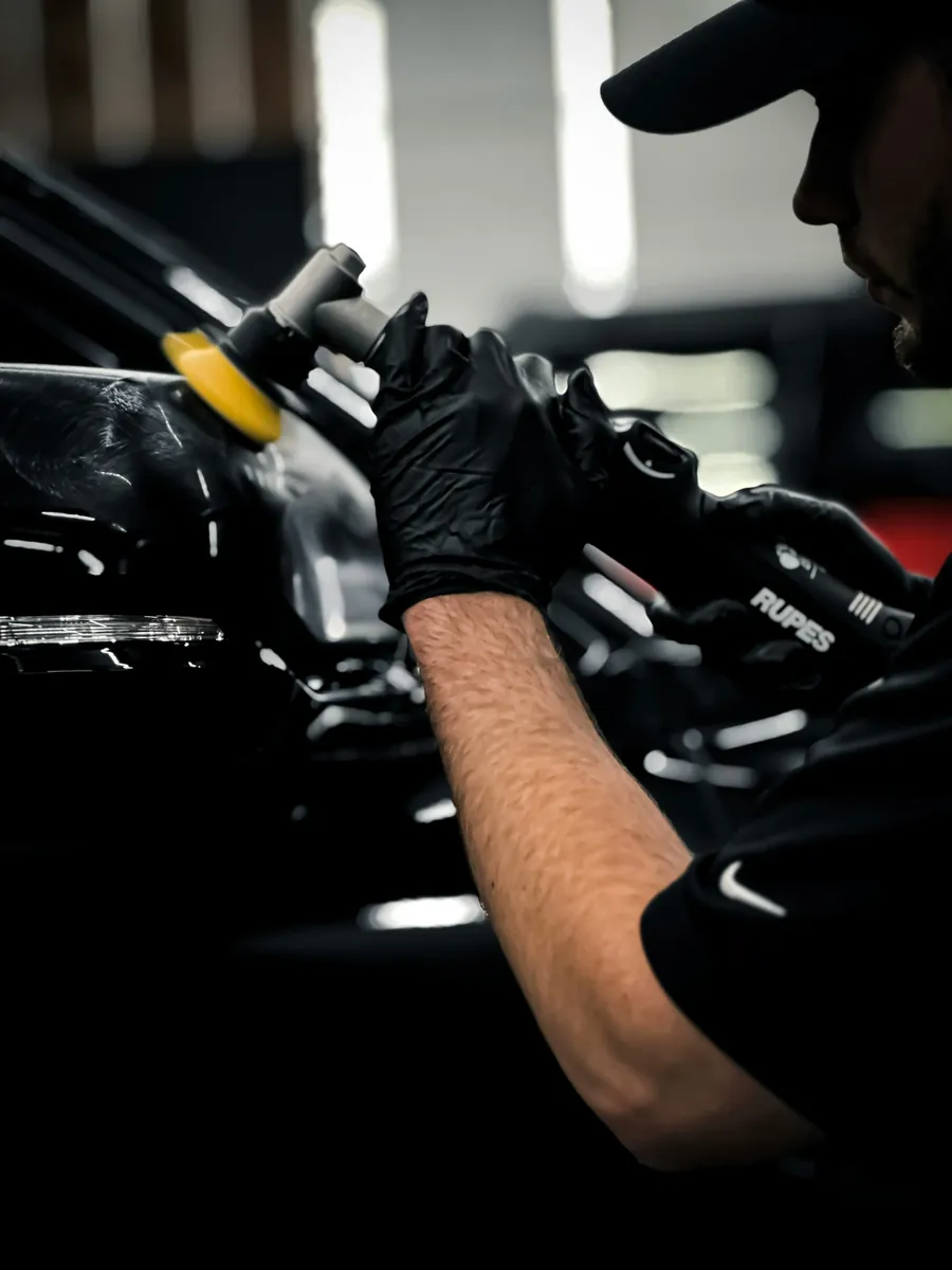
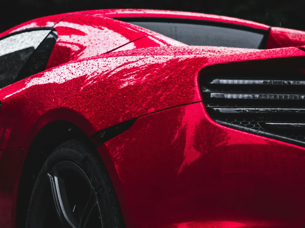
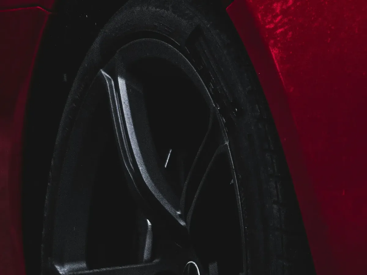
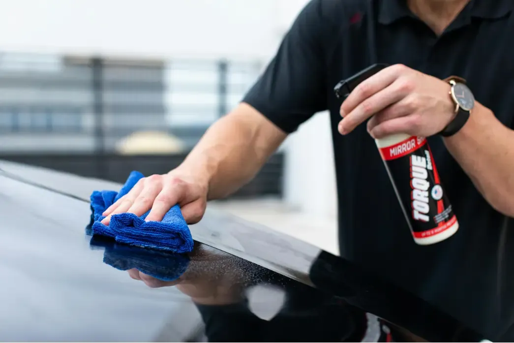
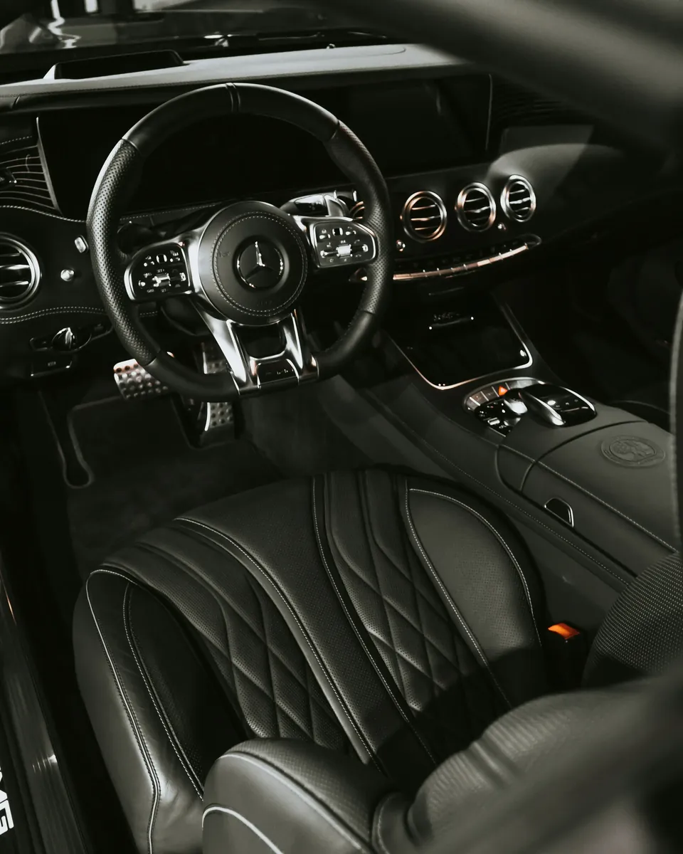
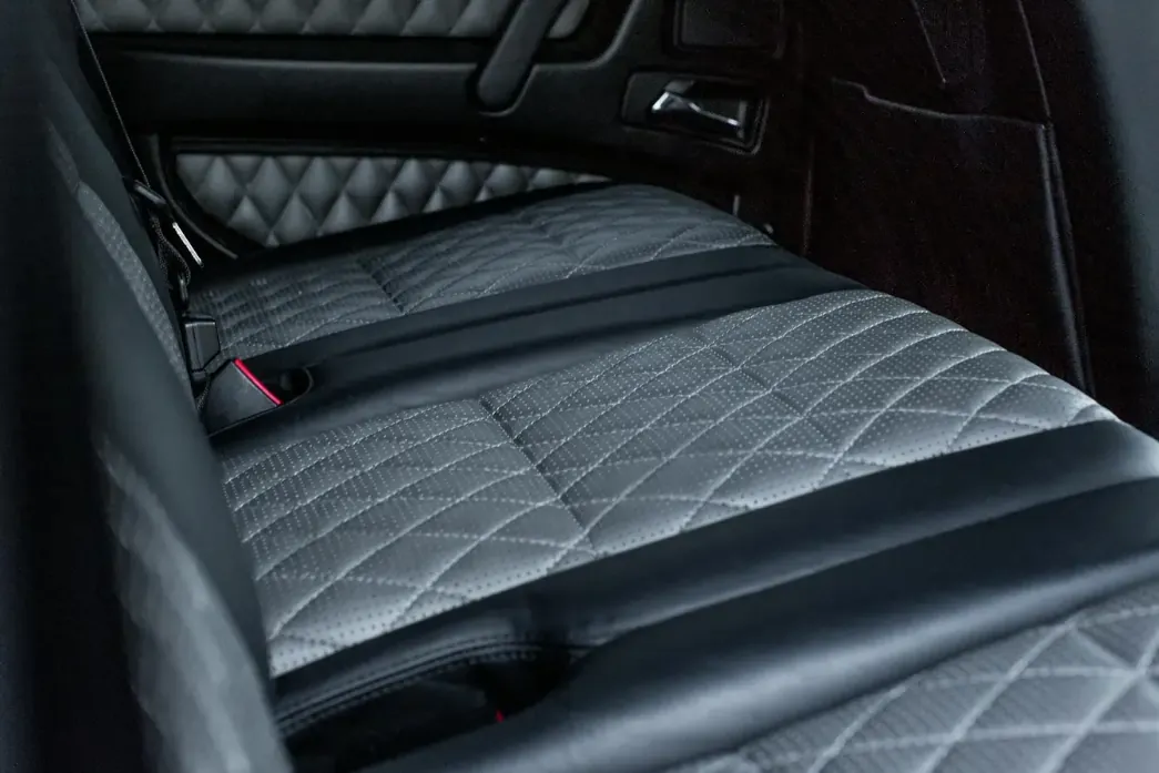
Real work. Real results. Premium experience.
- Crop close. One subject in the frame, filling it.
- Dark ground, and let the highlights carry the shape.
- Wet looks better than dry. Beading, spray, a fresh wipe.
- Hands in shot when a person is doing the work.
These six stand in until there is a shoot. Brand Kit 3.0 also asks for a headlight macro, and there is no frame of one in the library yet.
Voice & tone
- Professional but approachable
- Confident, not boastful
- Focused on results and value
- We speak to the customer's lifestyle
- Clear, respectful, and solution oriented
In practice: say what gets done, to what, and by when. A sentence that would be equally true on any other detailer's site is a sentence to cut.
Key words
- Protect
- Preserve
- Restore
- Maintain
- Refresh
- Shine
- Precision
- Convenience
- Professional
- Reliable
Ten words, set in Royal Blue when they appear as a set. In running copy they are ordinary verbs and take no styling.